Designing for They NYC has always been an incredibly fun and rewarding experience, and the funky designs I created for the brand's 2022 collection-- simply titled "The Square" and "Abstract," have been adored by so many people. Once I got the idea for this concept late at night, I waited until the next day to start drafting concepts.
Initially, the shirt was going to be filled in with gray-- making it easy to use across different apparel colors and accessories like stickers. However, I decided to go with a more modern version that could be easily altered to look great on almost any color.
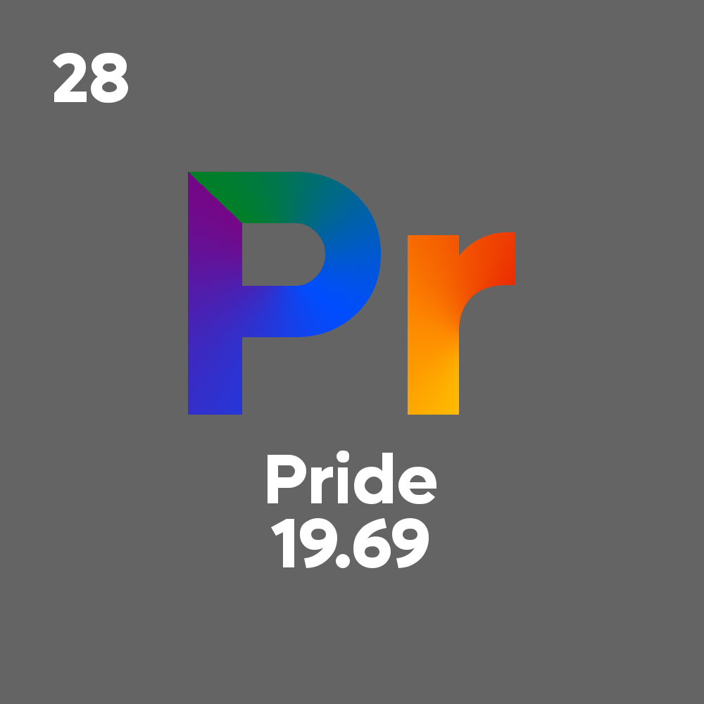
Early They Periodic Concept with Gray Background
Of course, the colors from the They Periodic design originate from Gilbert Baker's pride flag--putple, blue, and green on the P, and yellow, orange, and red on the R. While I usually dislike gradient effects, adjusting the angle and origin points made for a unique design that stands out. The purple and green colors in the P align at a near-perfect angle.
But, of course, there's more than just a "Pr" and "Pride" text on this design. What does the 28 mean? Or the 19.69? You may (or may not!) already know that on a periodic table, the digit in the top left would stand for the atomic number, and the digits below the Pride text would stand for the atomic mass.
Because Pride itself does not have an atomic number or mass, I decided to get creative. In the final version of the design, these numbers stand for one of the most notable dates in LGBTQ+ history, the start of the Stonewall Riots on June 28, 1969. If Pride were to have a place on the periodic table, it would replace Nickel's atomic number and have an atomic mass just between Fluorine and Neon!
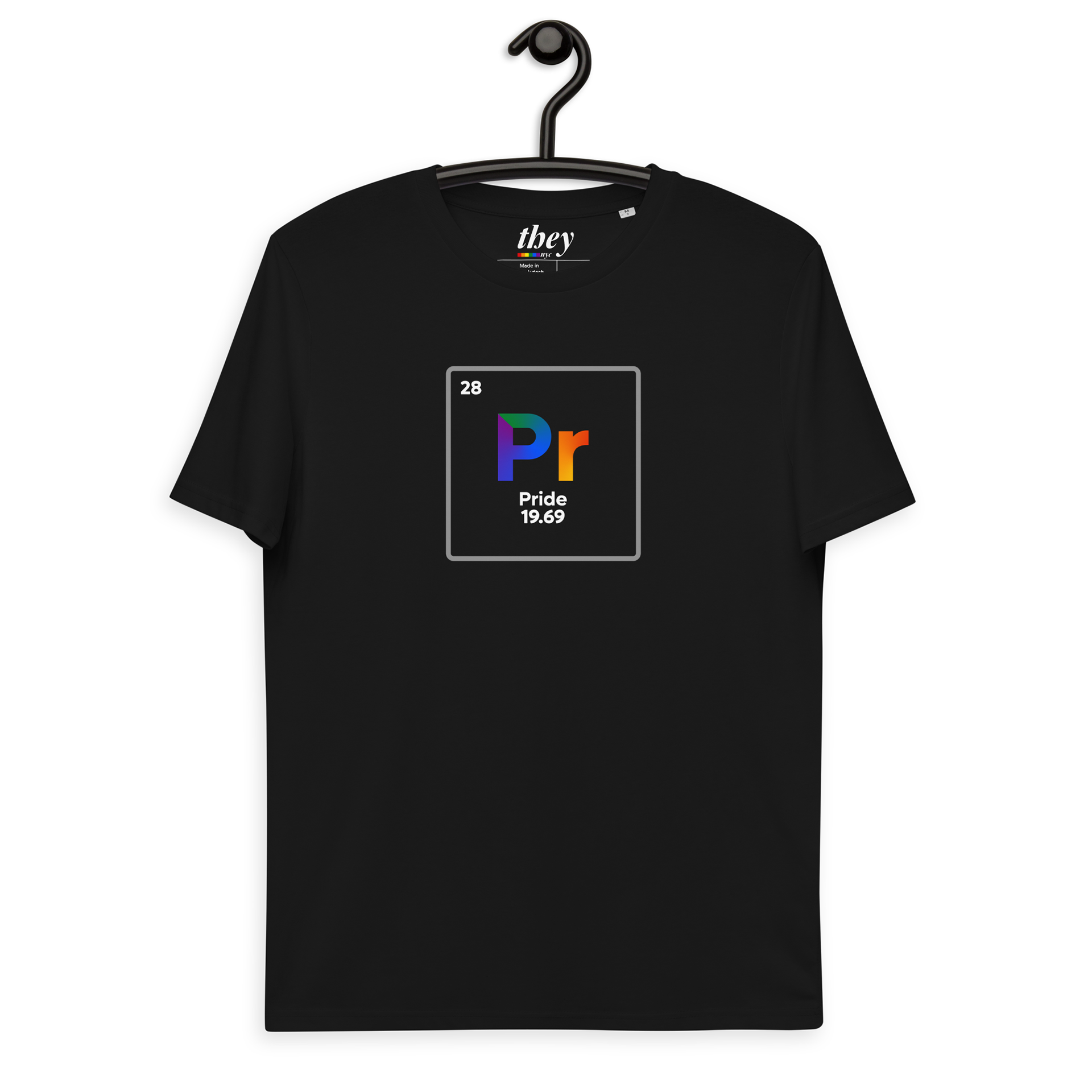
Finalized version of the They NYC Periodic T-Shirt