Hidden away on the spooky "Miscellaneous" page of my Portfolio lies two concepts. Two unofficial concepts about a little app called Discord. It reimagines Discord's settings screen, making it more accessible, more customizable, and more profitable. One may be wondering then... how did these simple concepts solve all of the problems I mentioned? Let's discuss it on this very post.
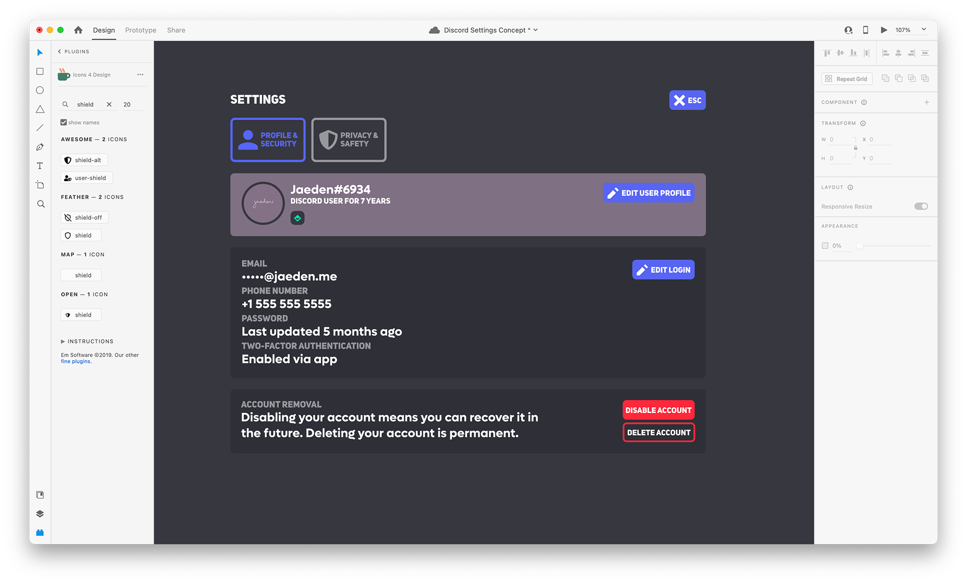
Early version of the Profile & Nitro page in the Adobe XD app
The Profile & Nitro page, initially, was going to be heavily inspired by the current Discord settings page-- with full-width content areas, but a relocated menu that stood out more. It was also going to be very very simple, with almost no new features to think of. But without any changes, there would be way too much unused space-- and I couldn't allow that!
So I dusted off my trackpad and stretched out my fingers, imagining how a reinspired Discord settings page could look. And within a day or so, out popped a beautiful concept allowing users to join or gift Nitro without having to switch pages at all. Tada-- the easier it is to buy something, the more profit!
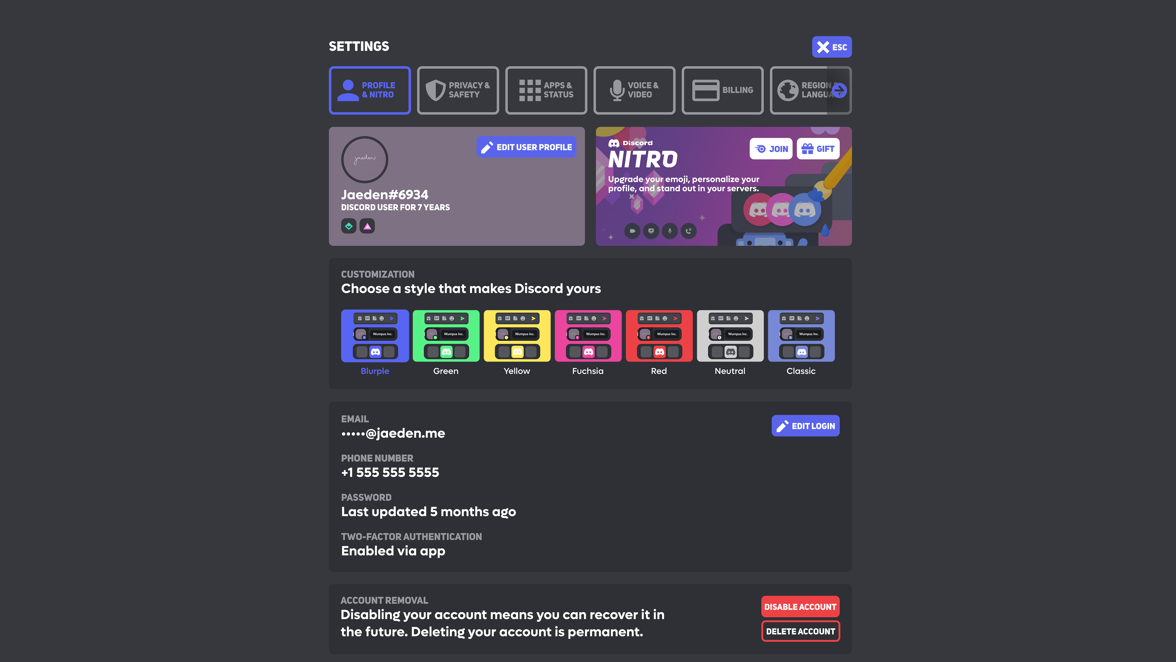
Finalized version of the Profile & Nitro page
Oh, but I wasn't going to leave it at money. Taking advice from the many people that hated the Discord redesign (side note: I actually liked it!), I added Customization Styles to the Discord app. Now, Discord's millions of users could easily choose between a modern and bright blurple, green, yellow, fuchsia, red, or a classic blurple with Discord's OG app icon-- all chosen from Discord's Branding page. There's also neutral, for those who think fun is just a little overrated.
Next up is the Discord Apps & Status page-- combining the existing Authorized Apps and Connections pages into one. Initially, the page was going to have a very similar appearance to the already finalized Profile & Nitro page, with 2 half-width sections at the top and full-width sections underneath.
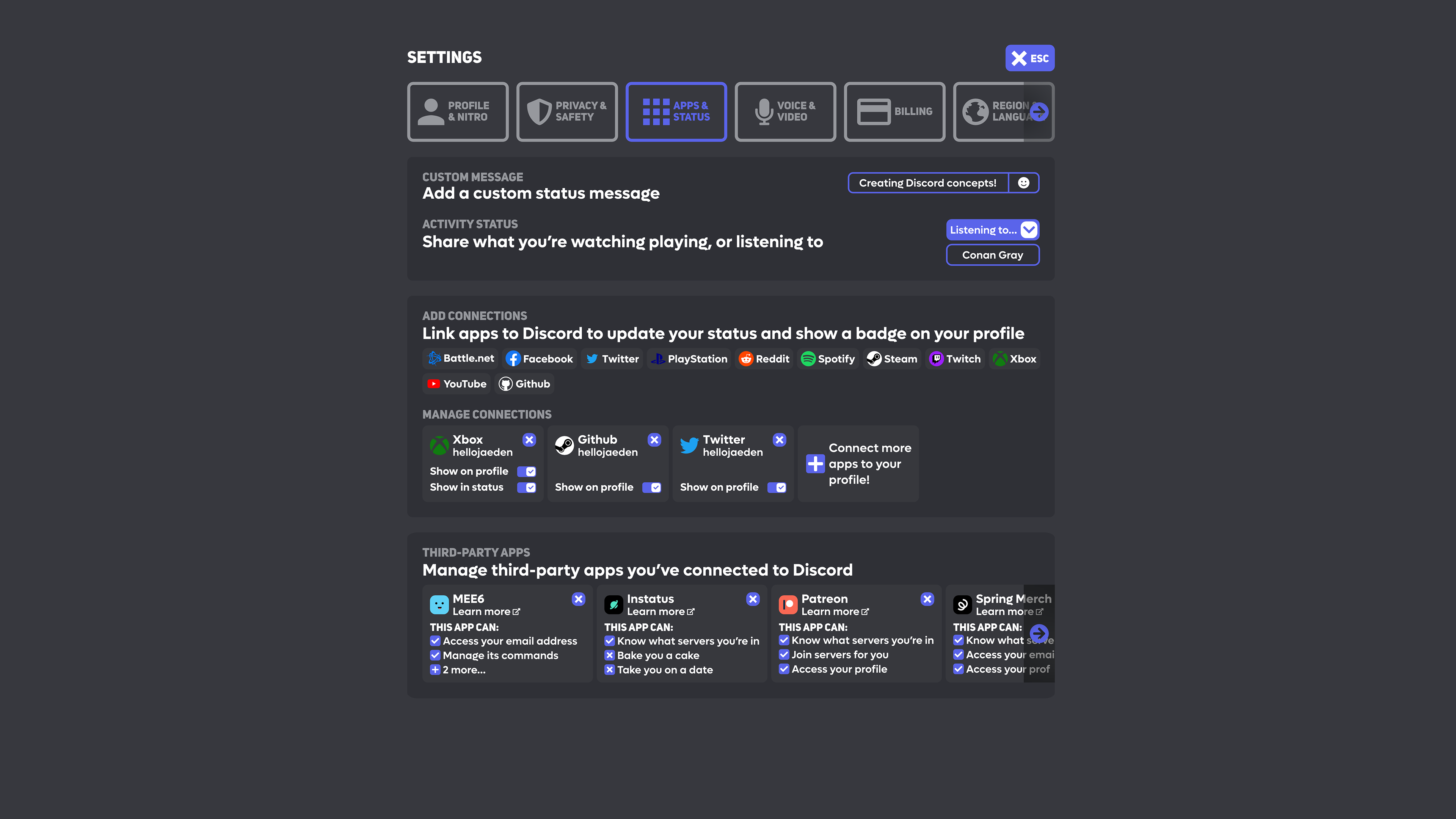
Early version of the Apps & Status page
Surprisingly, I have some sense of design and could tell that what you're looking at above... should not exist in any way. The Activity Status and Custom Message section was cluttered and inconsistent, and the Third-Party Apps section was way too small to read-- some text was as small as 8px, which certainly doesn't help my argument that these designs are more accessible.
After a refreshing Strawberry Açaí Refresher from Starbucks, I was ready to correct my mistakes. So I got to work-- first making sure the Custom Message and Activity Status section looked acceptable, then continuing on to the previously unfinished Add Connections panel. All of the apps now include names next to them, which not only tells you what that weird blue thing is at the front (sorry, Battle.net users) but is now consistent with Discord's mobile design.
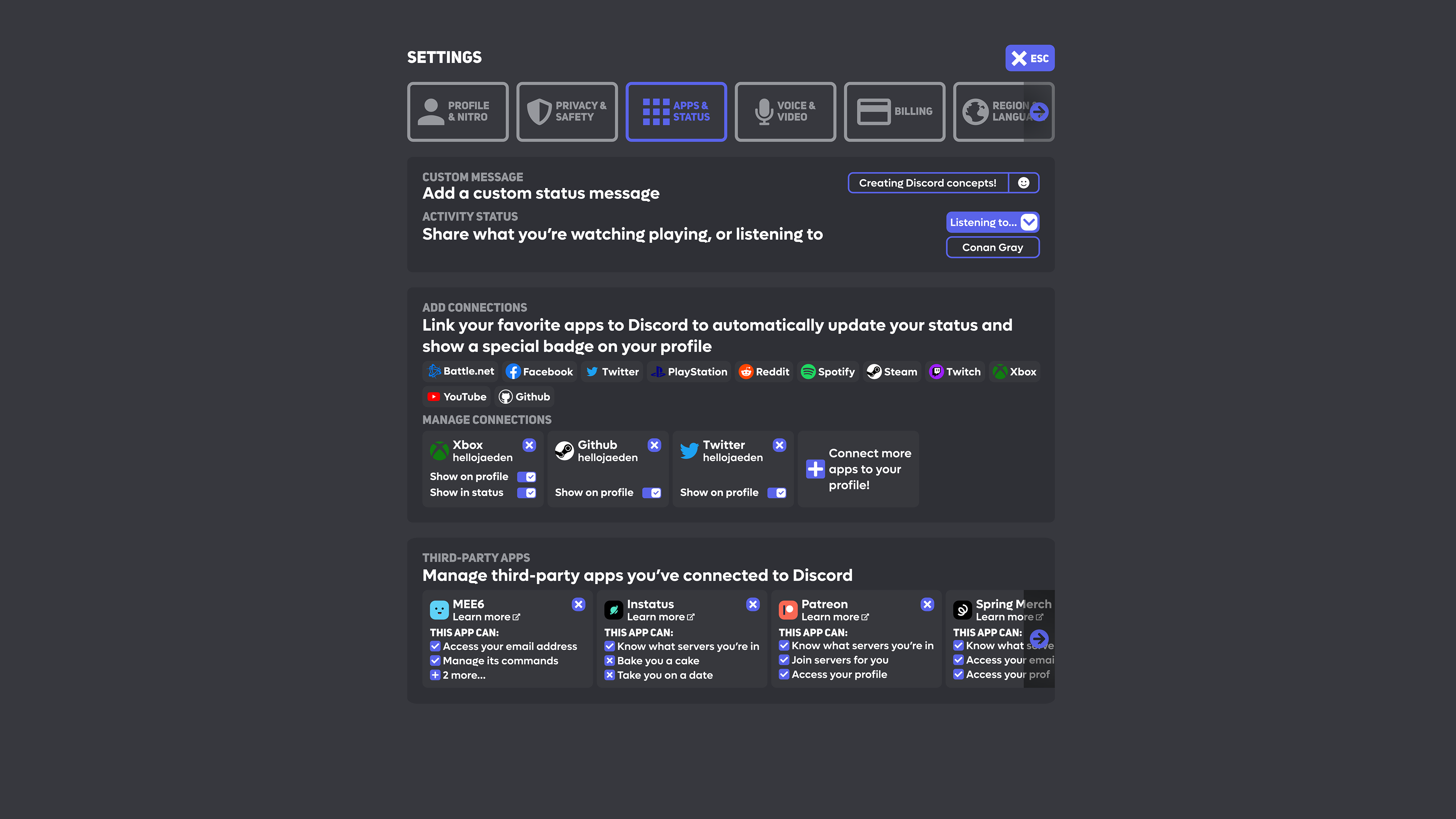
Finalized version of the Apps & Status page
The Manage Connections section, on the other hand, was a little trickier. Some apps only have one toggle, while others have two. I considered reducing the section size of apps that only have one toggle, but that would look inconsistent and, frankly, ugly. I also considered centering the app information, but I found that, too, looked inconsistent. The solution allows everything to look consistent-- with only small gap for those apps with just a single toggle.
On to the most horrifying part of the early version of the Apps & Status page-- Third-Party apps. I liked the general idea of it--keeping around an app icon to easily identify the app and the Delete button on the top right, ensuring it's consistent with the rest of the design (hello, Close Page button!)
I think the outlined design for individual Third-Party Apps looked okay, but to ensure it was consistent with the Manage Connections section, it's filled in in the finalized version of this concept. The permissions section is also reimagined, with fun messages if an app only has one or two permissions-- similar to the messages you get when Discord is loading. And if an app has more than three permissions, you'd be able to click the + icon to open a popup showing all permissions the app has access to.
It's easy, fun, and convenient.